
Browse data visualization Resources
-
#14ntcdataviz: DataViz! Tips, Tools, and How-tos for Visualizing Your Data [Resource Handout] This resource handout accompanied our presentation at the Nonprofit Technology Conference on March 13, 2014 in Washington, DC. Author: Johanna Morariu and Ann Emery, Innovation Network Type: Tipsheets & Paper Tools Date: Mar 13, 2014  Point K Pick
Be the first to review this resource!  Download (349.1 KB)
 -
#14ntcdataviz: DataViz! Tips, Tools, and How-tos for Visualizing Your Data [Slides] Presentation by Ann K. Emery, Johanna Morariu, and Andrew Means at the 2014 Nonprofit Technology Conference in Washington, DC. Author: Ann K. Emery and Johanna Morariu Type: Presentation Slides Date: Mar 13, 2014 Point K PickBe the first to review this resource!  Web Link
 -
#JAGUnity2014: DataViz for Philanthropists! Tips, Tools, and How-Tos for Communicating Better with Charts [Handout] This resource handout accompanied a presentation by Innovation Network's Johanna Morariu and Ann K. Emery for the Joint Affinity Group's Unity Conference on June 6, 2014 in Washington, DC. Author: Johanna Morariu and Ann K. Emery, Innovation Network Type: Tipsheets & Paper Tools Date: Jun 6, 2014 Be the first to review this resource! Download (255.28 KB) -
#JAGUnity2014: DataViz for Philanthropists! Tips, Tools, and How-Tos for Communicating Better with Charts [Slides] Presentation by Innovation Network's Johanna Morariu and Ann K. Emery at the Joint Affinity Groups Unity Conference, held June 6, 2014 in Washington, DC. Author: Johanna Morariu and Ann K. Emery, Innovation Network Type: Presentation Slides Date: Jun 6, 2014 Point K PickBe the first to review this resource! Web Link -
#YNPNdc14: DataViz! Tips, Tools, and How-tos for Visualizing Your Data [Resource Handout] Johanna Morariu and Ann K. Emery presented at the Young Nonprofit Professionals Network 2014 Annual Leadership Conference, which was held on May 9, 2014 in Washington, DC. Author: Johanna Morariu and Ann K. Emery, Innovation Network Type: Tipsheets & Paper Tools Date: May 9, 2014 Point K PickBe the first to review this resource! Download (253.7 KB) -
#YNPNdc14: DataViz! Tips, Tools, and How-tos for Visualizing Your Data [Slides] Johanna Morariu and Ann K. Emery presented at the Young Nonprofit Professionals Network 2014 Annual Leadership Conference, which was held on May 9, 2014 in Washington, DC. Author: Johanna Morariu and Ann K. Emery, Innovation Network Type: Presentation Slides Date: May 9, 2014 Point K PickBe the first to review this resource! Web Link -
A Dataviz Technique New to aea365 Johanna Morariu describes treemaps, a relatively new data visualization technique, especially to evaluators. The technique was created in the 1990s by Dr. Ben Shneiderman for mapping computer hard drive usage. Treemaps are useful for visualizing hierarchical data, or tree structure data. Area is used to proportionally illustrate differences in values, i.e., how many program participants fall into each of the nested categories. She also shares resources for making your own treemaps. Author: Johanna Morariu Type: Opinion (blog, editorial) Date: Jun 23, 2013 Be the first to review this resource! Web Link -
Assessing the Capacity of Community Coalitions to Advocate for Change (Presentation Handout) Research has shown that high-capacity coalitions are more successful in effecting community change. While a number of coalition assessment tools have been developed, documentation is scarce regarding how they are implemented, how the results are used, and whether they are predictive of coalition success in collaborative community change efforts.
Author: Veena Pankaj, Kat Athanasiades, Ann Emery, Johanna Morariu Type: Presentation Slides Date: May 22, 2013 Point K PickBe the first to review this resource! Download (377.49 KB) -
Beyond Boring Bar Charts [Slides] Tired of using the same old pie charts, bar charts, and line charts to tell your nonprofit’s story? Don’t have expensive data visualization software? Can’t afford to hire a graphic designer to transform your default Excel charts into polished masterpieces? In this 5-minute Ignite presentation at the Nonprofit Technology Conference, Ann Emery showed nonprofit leaders how to transform their default Excel charts by simply leveraging a little Excel elbow grease. Author: Ann K. Emery Type: Presentation Slides Date: Apr 22, 2013 Be the first to review this resource! Web Link -
Conquering the Dusty Shelf Report: Data Visualization for Evaluation In this blog post for Visualising Data, Johanna Morariu and Ann Emery share three tactics for tackling the Dusty Shelf Report in evaluation: captivating the readers with visuals, choosing the design that's right for the reader, and strengthening the dataviz literacy of readers. Author: Johanna Morariu and Ann Emery Type: Opinion (blog, editorial) Date: May 7, 2013 Be the first to review this resource! Web Link -
Data and Information Visualization Throughout the Evaluation Life Cycle for Participatory Evaluation and Evaluation Capacity Innovation Network shared approaches and examples of how to incorporate innovative data and information visualization techniques throughout each stage of the evaluation life cycle to support participatory evaluation and build evaluation capacity. In the planning and design phase mind mapping can be used to promote brainstorming and idea generation. In the data collection stage, evaluators can use creative visuals to improve stakeholder understanding of and participation in data collection, and evaluators can adhere to good design principles to create effective data collection instruments. Author: Johanna Morariu, Myia Welsh, Veena Pankaj, Melissa March Type: Presentation Slides Date: Nov 3, 2011 Be the first to review this resource! Web Link -
Data and Information Visualization Throughout the Life Cycle for Participatory Evaluation and Evaluation Capacity Building This is a handout containing a list of great resources to help improve your data visualization skills. The list provides links to websites that will help you design the right color scheme (such as Design Seeds), websites that provides basic information about principles of design, and great examples of how evaluators, statisticians, and computer scientists are using data viz to help us understand data better.
Author: Johanna Morariu and Veena Pankaj Type: Websites & Online Tools Date: Jan 1, 2013 Be the first to review this resource! Download (392.28 KB) -
Data Placemats: A DataViz Technique to Improve Stakeholder Understanding of Evaluation Results [Slides] At the American Evaluation Assocaition 2012 Annual Conference, Veena Pankaj describes various ways to improve stakeholder engagement, as well as ways to increase stakeholder understanding of evaluation results. Author: Veena Pankaj Type: Presentation Slides Date: Oct 25, 2012 Be the first to review this resource! Web Link -
Data Stories A podcast series on data visualization with Enrico Bertini and Moritz Stefaner
Author: Enrico Bertini and Moritz Stefaner Type: Workbooks & Guides Date: Jan 1, 2015 Be the first to review this resource! Web Link -
Data Visualization Approaches for Program Evaluation (and Beyond) 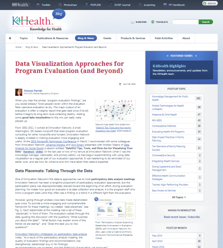 Simone Parrish writes,
"When you hear the phrase “program evaluation findings,” are you bored already? Most people—even within the evaluation field—perceive evaluation as dry. The major output of an evaluation is often a weighty report that gets read once (if at all) before it begins its long-term dust-collecting destiny.
Author: Simone Parrish Type: Opinion (blog, editorial) Date: Apr 29, 2014 Point K PickBe the first to review this resource! Web Link -
Dataviz! Or, How to Win at Communication and Influence People (Resources Handout) Are you intrigued by data and information visualization—dataviz—and how it could improve your communication strategy? Are you interested in the range of dataviz options, but unsure which is right for you? Or are you maybe even drowning in data and looking for someone to throw you a life-saving suggestion for tools to transform your data into a message?
Author: Johanna Morariu Type: Tipsheets & Paper Tools Date: May 17, 2013 Point K PickBe the first to review this resource! Download (510.3 KB) -
Evaluation Dashboards: Practical Solutions for Reporting Results In 2008 Innovation Network Senior Associates Veena Pankaj and Ehren Reed presented on dashboard usage for evaluation reporting at the annual Americal Evaluation Association. The handout and powerpoint slides cover four basic points:
- What is an evaluation dashboard?
- Why use a dashboard?
- When does an organization use a dashboard?
- How does an organization develop a dashboard?
Author: Ehren Reed and Veena Pankaj Type: Presentation Slides Date: Nov 7, 2008 Be the first to review this resource! Download (1.62 MB) -
Excel Elbow Grease: How to Fool Excel into Making (Pretty Much) Any Chart You Want In October 2013, Ann K. Emery presented How to fool Excel into making (pretty much) any chart you want at the American Evaluation Association's annual conference in Washington, D.C. She shared four strategies for communicating data more clearly in Excel: 1) Adjust default settings until charts pass the Squint Test; 2) Create two charts in one; 3) Create invisible sections of charts; and 4) Exploit the stock chart types, for example, by making timelines from stacked bar charts or by making dot plots from scatter plots. Author: Ann K. Emery Type: Presentation Slides Date: Oct 17, 2013 Point K PickBe the first to review this resource! Web Link -
How to Climb the R Learning Curve Without Falling Off the Cliff: Advice from Novice, Intermediate, and Advanced R Users R is hotter than ever in the evaluation field as evaluators are looking for ways to improve their data management, analysis, and visualizations. First-time R users are asking themselves, Is R right for my evaluation work? Where do I start if I want to learn R? How long will it take to learn R? Evaluators without programming experience are often frustrated by R's steep learning curve. These novice R users are left wondering, How can I climb the R learning curve without falling off the cliff?
Author: Tony Fujs, Will Fenn, Ann Emery Type: Tipsheets & Paper Tools Date: Oct 19, 2013 Point K PickBe the first to review this resource! Download (229.52 KB) -
How to Use Data Visualization to Better Tell Your Story Memos and metrics, emails and texts, newsletters and reports: Is your organization suffering from information overload? We consume 34 gigabytes, or 100,500 words, of information every day. Our brains are overwhelmed and struggling to keep up. Data visualization–or dataviz–is one of the strongest weapons against information overload. Author: Ann Emery Type: Opinion (blog, editorial) Date: Feb 1, 2014 Point K PickBe the first to review this resource! Web Link -
Picturing Your Data is Better Than 1000 Numbers: Data Visualization Techniques for Social Change Are you intrigued by infographics and how they could improve your communication strategy? Are you interested in what it takes for an organization to systematically use data? Or are you maybe even drowning in data and looking for someone to throw you a life-saving suggestion for software and other tools? Johanna Morariu, Beth Kanter, and Brian Kennedy presented a panel on data and information visualization at the 2012 Nonprofit Tech Conference. This video is a recording of the panel.
Author: Johanna Morariu Type: Presentation Slides Date: Be the first to review this resource! Web Link -
State of Evaluation 2010: Evaluation Practice and Capacity in the Nonprofit Sector Nonprofits hear a lot of talk about evaluation these days—metrics and measurements, indicators and impact, efficiency and effectiveness. Everyone, from donors to board members, seems to want evaluation results. But what are nonprofits really doing to evaluate their work? How are they really using evaluation results? What support are they getting? What else do they need?
Author: Innovation Network, Inc.; Morariu, Johanna; Reed, Ehren. Type: Research & Reports Date: Oct 1, 2010 Point K PickBe the first to review this resource! Download (5.55 MB) -
State of Evaluation 2012: Evaluation Practice and Capacity in the Nonprofit Sector The State of Evaluation 2012 report marks the second time Innovation Network has surveyed the U.S. nonprofit field to learn about evaluation practices and capacities! To learn more about the project, visit www.stateofevaluation.org. Author: Johanna Morariu, Katherine Athanasiades, and Ann K. Emery of Innovation Network, Inc. Type: Research & Reports Date: Oct 1, 2012 Point K PickBe the first to review this resource! Download (2.63 MB) -
The Dataviz Extravaganza Johanna Morariu and Ann Emery were guest participants on a recent Story By Numbers podcast where they provided a user-friendly introduction to Data Visualization. They introduce the listener to DataViz and discuss ways to choose the right kind of chart for different types of data. Author: Johanna Morariu and Ann Emery Type: Websites & Online Tools Date: Sep 11, 2012 Be the first to review this resource! Web Link -
The Dataviz Hall of Fame for Evaluation In this blog post for the American Evaluation Association, Ann Emery shares Hall of Fame-worthy examples of data visualization in the evaluation field. She describes how evaluators are creating innovative, practical, and interactive visualizations; are thinking beyond standard reporting formats; and have capitalized on visual thinking skills. Author: Ann Emery Type: Opinion (blog, editorial) Date: Jun 24, 2013 Be the first to review this resource! Web Link